Striving for Performance and Design Harmony in Web Development

Photo by Edho Pratama on Unsplash
In modern web development, a fine balance between performance and user-centric design is key. It doesn't just enhance visitor retention; it deepens their interaction with the content. My recent project provided me a deep dive into achieving this delicate balance. Here is a recount of my experience and the insights that I've gained.
The Task at Hand
The project involved transforming a site initially built using 11ty and Forestry CMS. The goal was clear: transitioning to Cloudcannon and securing top-notch performance metrics across the board.
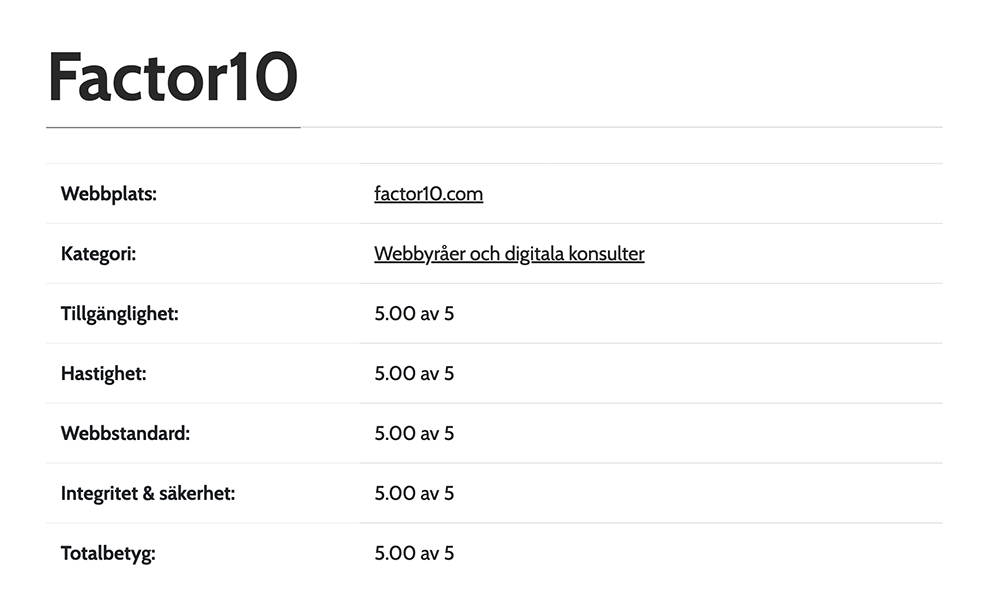 The website's final scores
for accessibility, speed, standards, privacy, and security. Securing it the top position of all
websites in Sweden measured by webperf.se.
The website's final scores
for accessibility, speed, standards, privacy, and security. Securing it the top position of all
websites in Sweden measured by webperf.se.
Crafting the Developer Experience
A well crafted website not only looks good but is also built upon pillars of performance, accessibility, and best practices. Here, tools like Tailwind offer an appealing promise of swift development. However, every tool has its caveats. In the case of Tailwind, it produced CSS with custom properties, a feature that at that point was yet to be standardized. Instead of letting this be a setback, I explored alternatives to establish an equally efficient and issue-free developer environment.
Embracing Modular CSS
Let's dive a bit into the CSS. A modular CSS structure promises maintainability and scalability in design, paving the way for rapid feature deployment and updates. It ensures that while each component stands on its own, it is harmonious with overarching design. The structure we employed embodies this principle:
component-library/
├─ components/
│  └─ sample/
│     ├─ sample.bookshop.yml
│     ├─ sample.test.js
│     ├─ sample.scss
│     └─ sample.eleventy.liquid
└─ shared/
   └─ styles/
      ├─ global.scss
      └─ variables.scss
But what makes this structure dynamic? Enter SCSS. A powerful extension of the traditional CSS, SCSS bestows developers with features like variables and nested rules. While vanilla CSS has its merits, SCSS allows for a more dynamic and fluid styling approach. Our build process uses tools like Sass to consolidate and optimize SCSS files, ensuring seamless style deployment. The journey from SCSS to optimized CSS follows these steps:
- Identify the SCSS files.
- Compile them into regular CSS.
- Optimize the resultant CSS.
- Store it for deployment.
Discovery
To begin the journey of styling optimization, we must first pinpoint where all the styles reside.
Utilizing fast-glob, we efficiently traverse the file
system, seeking out the SCSS files. Imagine wanting to identify all .scss and .css files within
the src directory. Here is how it would look:
const fg = require('fast-glob')
const entries = await fg('src/**/*.{css,scss}')
Compilation
Having identified our list of SCSS files, the next step is compilation. Conventionally, you'd find a
"main" SCSS file that @imports other SCSS files, setting up a clear hierarchy. Compiling this main
file processes all the imported files in the order of their appearance.
const sass = require('sass')
const output = sass.renderSync({ file: 'path/to/main.scss' })
A more flexible alternative to the traditional method is dynamic compilation, as exemplified by the Bookshop sass bundler:
const sassInput = entries.map((file) => `@import "${file}";`).join('\n')
const output = sass.renderSync({ data: sassInput })
Here, we create an in-memory virtual SCSS file that imports every SCSS file detected. By compiling it, we incorporate all unique component styles.
Post-Processing
Compilation, while crucial, is just one part of the equation. We must enhance and optimize the compiled styles. This is where powerful tools like PostCSS and cssnano come into play.
PostCSS is a tool that doesn't merely refine styles — it transforms them through its plugin-based system, allowing developers to decide exactly which transformations they want to apply. The Autoprefixer plugin is a prime example, appending vendor prefixes based on Can I use data, ensuring consistent cross-browser compatibility. While PostCSS transforms, cssnano tightens. It compresses, strips, and trims the CSS into its leanest form.
const postcss = require('postcss')
const cssnano = require('cssnano')
const autoprefixer = require('autoprefixer')

const inputCSS = 'a { transition: transform 1s; }' // Simple CSS for demonstration.

const processedCSS = await postcss([autoprefixer, cssnano]).process(inputCSS)

const finalCss = processedCSS.css
Together, PostCSS and cssnano aim to make our CSS not only adaptable but also blazing fast.
Writing
Having navigated the maze of style optimization, our last step is simple: writing our refined and optimized CSS to a file.
Render Time
Ensuring fast page rendering is crucial for a seamless user experience. To realize this, we must permit the browser to begin rendering even as resources are still in the loading phase. The primary challenge lies in eliminating layout shifts and avoiding any sudden visual disturbances. For optimal performance, resource loading and deployment must be carefully managed, particularly given the potential influence on the page during their loading phase.
Font display
While custom fonts can undeniably elevate a website's aesthetic appeal, they may impede rendering speed. Yet, with the technique of font swapping, it's possible to strike a balance between aesthetics and efficiency.
By integrating font swapping in our CSS, the browser is directed to utilize a system or fallback font while the page is still loading. This circumvents the scenario where users find themselves gazing at an empty space. Once the custom font has been fully loaded, the browser subtly switches to it, ensuring that the design's integrity remains uncompromised without any delay for the user. The font-display descriptor facilitates this:
font-display: swap;Enhancing font loading further, preloading the font primes the browser early about its significance, allowing for efficient downloading.
<link rel="preload" href="/fonts/font.woff2" as="font" type="font/woff2" crossorigin />The above method achieves this without introducing any JavaScript to our site.
Critical CSS
The term 'above-the-fold' originates from newspaper design, referring to the content immediately visible when a page loads, without the need for scrolling. By prioritizing the delivery of the critical CSS necessary for this portion, we ensure the user's first impression is swift and seamless.
We do this by inlining these critical styles directly into the HTML's <head>, and thereby allowing
the browser to immediately render the immediate content without having to wait for the entire
stylesheet to load. The npm package, critical, offers a
simplified solution:
const critical = require('critical')

critical.generate({
  inline: true, // Will inline the generated CSS into the HTML
  base: 'dist/', // Your base directory
  src: 'index.html', // Source HTML file to be processed
  width: 1300, // Viewport width
  height: 900, // Viewport height
  ignore: {
    // Rules to ignore, e.g., font-face which can be hefty
    atrule: ['@font-face'],
  },
})
In the above example, the index.html file is analyzed to determine the styles needed for its
above-the-fold content, and are subsequently inlined.
This strategy provides several benefits. It accelerates the initial content rendering, allowing earlier user interaction, and side-steps render blocking delays.
Layout shifts
Responsive design has revolutionized how sites adjust across devices, but it's not without hurdles. For instance, while strategies like asynchronous content loading shows a lot of 'promise' — pun very much intended — it can occasionally result in unexpected layout shifts. Such shifts disorient users, leading to unintended clicks and detracting from a seamless browsing experience.
A hands-on approach is to establish size constraints for elements that might adjust with incoming
content. As an example, if a font swap alters an element's dimensions, the application of
min-height and min-width becomes a vital safeguard. This strategy ensures that our content is
primed to adapt to any changes, be they CMS updates or device reconfigurations, whilst maintaining a
steadfast structure.
Responsive Images
As screen sizes become more diverse, the need for responsive image techniques grows. Choosing the
right image size not only boosts a website's visual appeal but also ensures optimal performance.
Here, the HTML attribute, sizes, stands out.
The sizes attribute of the picture element allows us to guide the browser on the image display
size for varying viewport conditions. By defining both upper and lower limits with this attribute,
we ensure the best-suited image variant gets loaded.
For instance, with the sizes attribute, we can dictate how the image adapts across different
device widths. Here is how it works:
(min-width: 1280px) 426px, (min-width: 768px) and (max-width: 1280px) 33vw, (min-width: 640px) and
(max-width: 768px) 50vw, (max-width: 640px) 100vw- For screens wider than 1280 pixels, the image will be displayed at a fixed width of 426 pixels.
- For screens between 768 and 1280 pixels, the image will take up 33% of the viewport width.
- On screens ranging from 640 to 768 pixels, the image will cover half the viewport width.
- For a screen width of 640 pixels or fewer, the image will span the entire viewport width.
Alongside the sizes attribute, it's worth highlighting the value of srcset. While we dictate
display conditions with sizes, srcset lists multiple image versions, letting the browser select
the optimal one based on device specifics.
The result is crisp visuals across devices, faster page loads, saved energy, and reduced bandwidth use.
Security
At first glance, embedding inline CSS directly into HTML appears to be a straightforward approach to styling. Yet, this simplicity can be deceptive, as it opens up potential security vulnerabilities and challenges, particularly when the CSS undergoes changes during development.
To counter such vulnerabilities, modern browsers have incorporated a security feature called the Content Security Policy (CSP) Header. This feature delineates where various content types, be it scripts, styles, or images, can be sourced from, ensuring that only content from trusted sources gets executed or rendered.
The significance of CSP becomes even clearer when we consider threats like cross-site scripting. This nefarious tactic allows attackers to inject code into web pages that unsuspecting users then view. Not only can it jeopardize user data, but it can also transform reputable sites into hubs of malicious activity. The CSP stands as a safeguard against these and other similar threats.
Now, when one chooses to go the route of inlining CSS, a specific hash of the content needs to be added to the CSP header, signaling to the browser that this content is legitimate. But there is a catch: should the styling undergo any alterations during development, which is often the case, the associated hash needs a recalculation and subsequent update on the server. This step, often done manually, is both labor-intensive and susceptible to errors.
A possible workaround is the use of a nonce — a unique, one-time token. However, this method demands a dynamic setting, such as a Node server. Given that our platform is tailored to serve only static files, venturing into such complexities is unwarranted.
Automation
We can make this process smoother and hands-free by utilizing a Python script during deployment:
- First, we scan for HTML files: Store the deployment in a processing directory and sift through it, identifying the HTML files.
- Detect Inline Styles: The script then parses the HTML files for inline styles.
- Hash Calculation: For each detected style, the script computes its hash.
- Config File Generation: Using a predefined template, the script produces a new configuration file
for the site. Within this file, a placeholder is replaced with the calculated
style-srchashes. - Deployment and Validation: A critical step in the process. Before pushing any changes, the script runs a series of tests and checks, validates the syntax and other parameters. Only when the validation succeeds are the deployment files sent to their designated destination. Subsequently, the configuration file is refreshed, and the server reloads it.
- Cleanup: If tests uncover issues or anomalies, all interim changes within the processing directory are discarded without affecting the live website.
This allows us to safeguard our site's security while also eliminating manual intervention that can be tedious and error-prone.
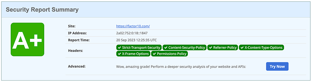 Summary of the headers security analysis from securityheaders.com
Putting it all together
By harnessing these strategies, we create sites that excel both visually and functionally. In the end, the elegance of a website isn't just in its visible design but also in its underlying mechanics. As designers and developers, our goal is to master both fronts, crafting experiences that are not only beautiful but are also performant, secure, and sustainable.
With this, I would like to thank my colleagues at factor10 from whom I learn every day. I would also like to thank my co-workers Anders and Peter who have worked alongside me for their excellent work.
Feel free to check out the result for yourself: factor10.com